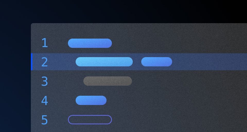
The Code Editor is used to edit formatted code. It supports syntax highlighting, auto-closing brackets and quotes, and a custom yielded section for additional functions.
Usage
When to use
- When a user needs to create code from scratch
- When code requires modification from an existing source
When not to use
- As a read-only reference for code, use the Code Block instead.
Standalone
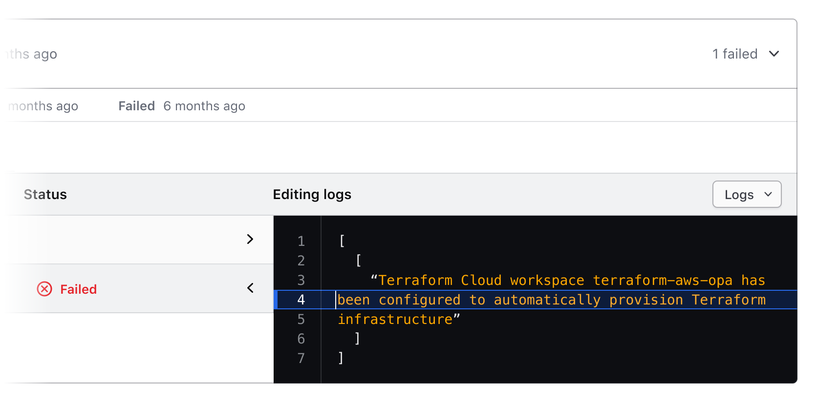
The isStandalone property increases the portability of the Code Editor to ensure that it can be used in different contexts. For example, a common use case of the Code Editor is in a "standalone" context, which can be part of a form, multi-step process, and is generally a part of the normal layout flow.

Sometimes it may be necessary to use the Code Editor in a more dense layout or nested within another component.
Header
The header is optionally available within the Code Editor. It consists of three sections that can be toggled as needed: the text content that includes the title and description, an actions container for secondary actions, and a custom yielded section of primary actions.
When to use a title and description
A title and description provides additional contextual information for the Code Editor. An accessible name is mandatory and can either be provided by the title or by an external text element.
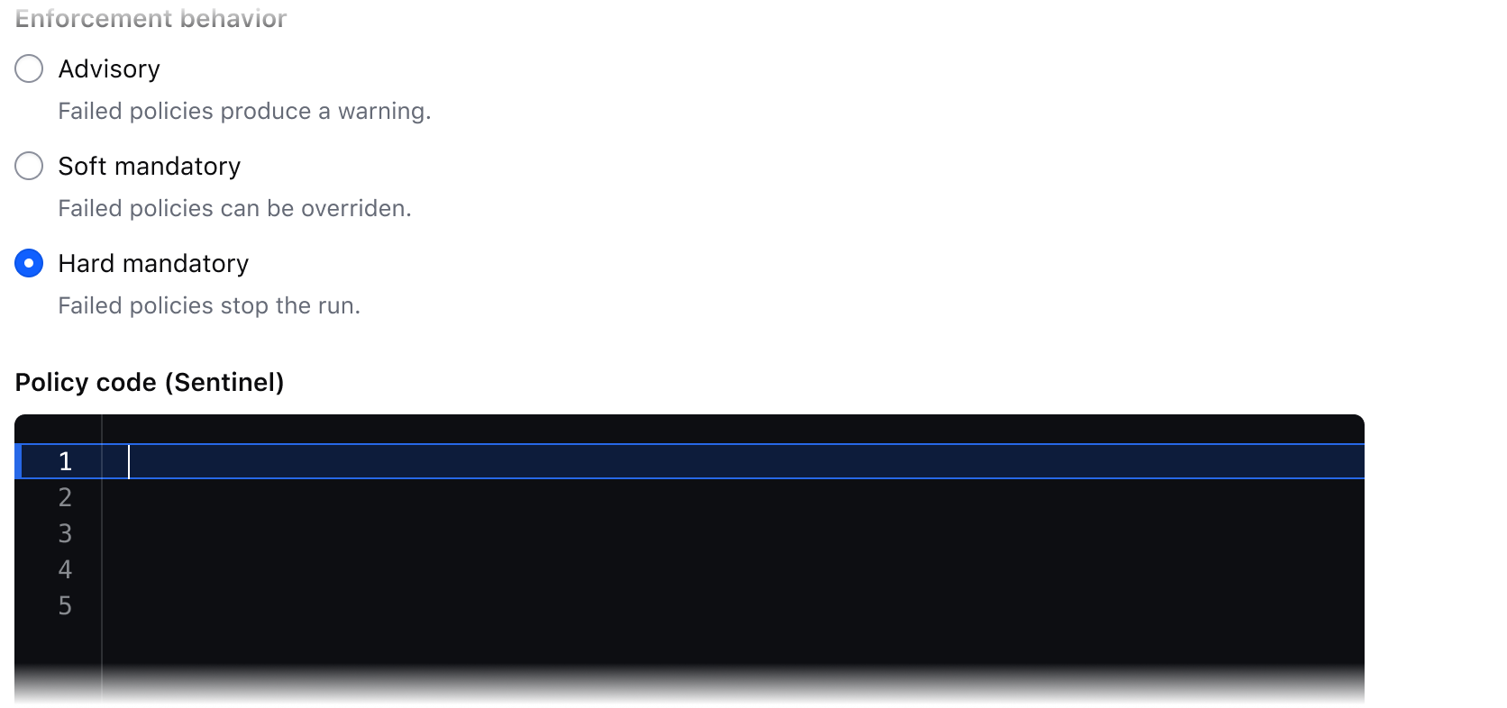
This provides an accessible name for the Code Editor so that a user and assistive technology can understand its purpose.
Assuming a user would understand the intent of the Code Editor without providing an accessible name will cause confusion and fail on accessibility requirements.
Secondary actions
The secondary actions section is for two individually optional buttons: CopyButton and a button to expand the editor. The CopyButton copies the content of the CodeEditor to clipboard (more details can be found in the CopyButton guidelines), while the other button maximizes and minimizes the Code Editor view from inline to full screen (and back again). These actions are considered supporting functions that are less vital to the user’s work but may be useful.

Custom yielded actions
This space is reserved for primary custom yielded actions. Primary actions are defined as necessary for the user to complete their work.

The Code Editor has limited support for dark mode styles and requires consumer maintenance until a dark mode theme is released. Only Buttons have pre-defined dark mode styles in the Code Editor.
External elements
Some elements or functions outside the Code Editor may affect the content within the Code Editor. In this case, we recommend turning off the header helps unify the editor with the nearby elements.

Active line highlighting
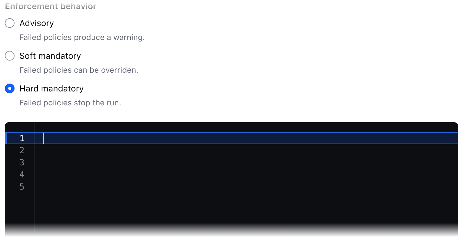
When a user is editing code on a single line, a highlight will be present to emphasize their location in the Code Editor.

When a user selects code (even if it’s within a single line), the active line highlight will no longer be present, however, the line number on the left will remain highlighted. The highlighted number will be present wherever the cursor is located.

Bracket highlighting
The Code Editor will automatically close quotes and brackets as the user writes their code. When the user’s cursor is next to a bracket, that bracket will highlight to show the start and end of the pair.

Language
Language determines how syntax highlighting is applied and formatted within the editor but is handled a bit differently between the Ember and Figma components.
The Ember component uses CodeMirror to handle syntax highlighting and comes with a pre-defined set of languages.
In Figma we provide a handful of example languages that are intended to be representative of the end result in production. Syntax highlighting in Figma is a non-trivial process and requires the manual application of color styles to each "type" of code. Despite this, creating a custom code snippet with the Code Editor is supported by typing/pasting into the text layer, but syntax highlighting will not be automatically applied.
Applying syntax highlighting
If you wish to create custom examples using the Code Editor, we publish all of the relevant syntax highlighting variables in the HDS Components v2.0 library. However, due to the number of languages supported by the component, the color variables use a generic naming schema (e.g., cyan, red, purple) to remain as agnostic as possible when being applied to different languages. For more details around syntax visit the specifications.
How to use this component
The basic invocation doesn't require any arguments.
<Hds::CodeEditor />
Title and description
Optionally, you can pass a title and/or a description.
<Hds::CodeEditor @value="Hello, world" as |CE|>
  <CE.Title>
    CodeEditor title
  </CE.Title>
  <CE.Description>
    CodeEditor description
  </CE.Description>
</Hds::CodeEditor>
Title tag
The @tag argument changes the HTML element that wraps the [CE].Title content. When organizing the content on a webpage, the heading levels should reflect the structure of the page. For example, if a CodeEditor is within a subsection of the page below a heading level 2, the value should be "h3".
Learn to write functions in Go
Functions are a critical part of learning Go. They are reusable chunks of code that can perform tasks like convert an object to an array.
<div class="doc-code-block-demo-heading">
  <Hds::Text::Display @tag="h2" @size="300">Learn to write functions in Go</Hds::Text::Display>
  <Hds::Text::Body @tag="p">Functions are a critical part of learning Go. They are reusable chunks of code that can perform tasks like convert an object to an array.</Hds::Text::Body>
</div>
<Hds::CodeEditor
  @language="go"
  @value={{this.goCode}}
  as |CE|>
  <CE.Title @tag="h3">
    convertObjectToArray.js
  </CE.Title>
</Hds::CodeEditor>
Language
The language argument sets the syntax highlighting used. We only support the following languages: json, sql, go, hcl. If you need additional languages contact the Design Systems Team
<Hds::CodeEditor
  @language="go"
  @value={{this.goCode}}
/>
Copy button
Set hasCopyButton to true to display a button for users to copy CodeEditor content to their computer clipboard.
<Hds::CodeEditor @hasCopyButton={{true}} @value={{this.loremIpsum}} />
Component API
This component uses CodeMirror under the hood.
CodeEditor
<[CE].Title>
yielded component
ContentBlock::Title yielded as contextual component (see below).
<[CE].Description>
yielded component
ContentBlock::Description yielded as contextual component (see below).
value
string
CodeEditor.
language
string
- json
- sql
- go
- hcl
hasCopyButton
boolean
- false (default)
hasFullScreenButton
boolean
- false (default)
Contextual components
[CB].Title
The CodeEditor::Title component, yielded as contextual component.
yield
strong, em, a, code/pre. Consumers will need to style other HTML tags if used as children.
tag
enum
- p
- h1
- h2 (default)
- h3
- h4
- h5
- h6
…attributes
...attributes.
[CB].Description
The CodeEditor::Description component, yielded as contextual component.
yield
strong, em, a, code/pre. Consumers will need to style other HTML tags if used as children
…attributes
...attributes.
Anatomy
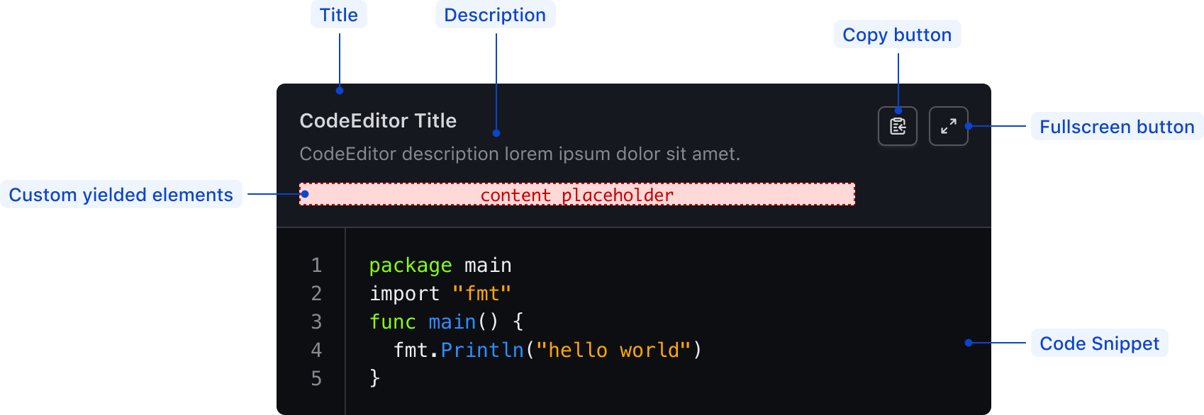
| Element | Usage |
|---|---|
| Title | Optional |
| Description | Optional |
| Custom yielded elements | Optional |
| Copy button | Optional |
| Expand button | Optional |
| Code snippet | Required |
Syntax highlighting
To aid in understanding how the highlighting theme is applied via CodeMiror's tokens, we've provided a high-level, non-exhaustive list of token names and how they might be applied depending on the syntax.
| Color | Usage |
|---|---|
| Cyan | Property, url, or operator |
| Blue | Function, builtins |
| Orange | Strings, characters |
| Purple | Booleans, numbers |
| Green | Keywords, class names, saving the world |
| Red | Important items |
| White | Default color within the code block, also used for punctuation (<, { }, =, etc) |
| Gray | Used for comments across languages |
States
Conformance rating
When used as recommended, there should not be any WCAG conformance issues with this component.
Applicable WCAG Success Criteria
This section is for reference only. This component intends to conform to the following WCAG Success Criteria:
-
1.3.1
Info and Relationships (Level A):
Information, structure, and relationships conveyed through presentation can be programmatically determined or are available in text. -
1.3.2
Meaningful Sequence (Level A):
When the sequence in which content is presented affects its meaning, a correct reading sequence can be programmatically determined. -
1.4.1
Use of Color (Level A):
Color is not used as the only visual means of conveying information, indicating an action, prompting a response, or distinguishing a visual element. -
1.4.10
Reflow (Level AA):
Content can be presented without loss of information or functionality, and without requiring scrolling in two dimensions. -
1.4.11
Non-text Contrast (Level AA):
The visual presentation of the following have a contrast ratio of at least 3:1 against adjacent color(s): user interface components; graphical objects. -
1.4.12
Text Spacing (Level AA):
No loss of content or functionality occurs by setting all of the following and by changing no other style property: line height set to 1.5; spacing following paragraphs set to at least 2x the font size; letter-spacing set at least 0.12x of the font size, word spacing set to at least 0.16 times the font size. -
1.4.3
Minimum Contrast (Level AA):
The visual presentation of text and images of text has a contrast ratio of at least 4.5:1 -
1.4.4
Resize Text (Level AA):
Except for captions and images of text, text can be resized without assistive technology up to 200 percent without loss of content or functionality. -
2.1.1
Keyboard (Level A):
All functionality of the content is operable through a keyboard interface. -
2.1.2
No Keyboard Trap (Level A):
If keyboard focus can be moved to a component of the page using a keyboard interface, then focus can be moved away from that component using only a keyboard interface. -
2.4.3
Focus Order (Level A):
If a Web page can be navigated sequentially and the navigation sequences affect meaning or operation, focusable components receive focus in an order that preserves meaning and operability. -
2.4.7
Focus Visible (Level AA):
Any keyboard operable user interface has a mode of operation where the keyboard focus indicator is visible. -
4.1.2
Name, Role, Value (Level A):
For all user interface components, the name and role can be programmatically determined; states, properties, and values that can be set by the user can be programmatically set; and notification of changes to these items is available to user agents, including assistive technologies.
Support
If any accessibility issues have been found within this component, let us know by submitting an issue.
4.15.0
Added
Added the Hds::CodeEditor component.
